Mycaptain
Description
As a pre-Series A enterprise focusing on internet-based education, our site is not merely an online marketplace; it's the passage to wisdom and commerce position. The overhaul of this website looks to heighten our corporate standards and fine-tune your platform for superior user involvement and conversion rate.
Client
Mycaptain
Year
2023
Type of Project
Branding
BRIEF
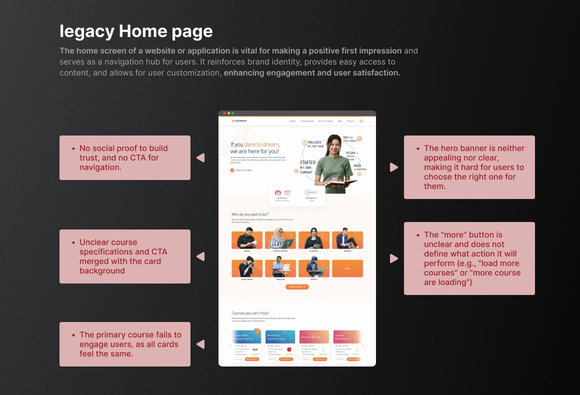
PROBLEM
Decline in User Engagement
The decrease in user engagement, impacting return visits, and crucial word-of-mouth recommendations for organic growth.
Poor Navigation Structure
Finding core content was a real headache. Important things were hidden, and the menus were all over the place
Lack of Mobile Optimization
The website's lack of mobile optimization is a big miss, it looks terrible and is hard to use on phones and tablets
Outdated Design Aesthetics
The site has issues with outdated design, navigation, leading to decreased user involvement and client satisfaction, impacting the organization's growth and industry standing.
GOAL
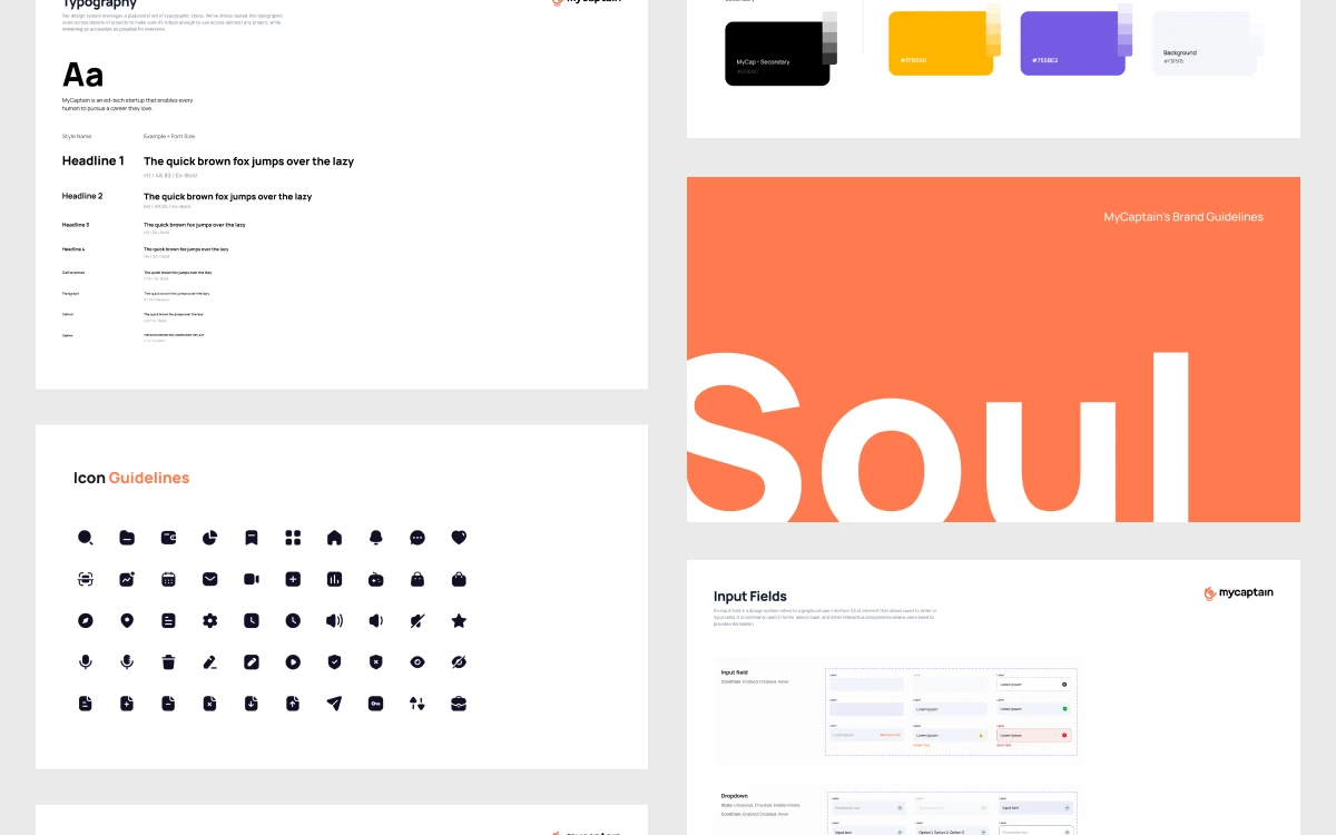
Unified Design Language
We aimed to create a unified design system, including typography, color styles, and component to express our brand identity.
Optimize Conversion Rates
Implement clear call-to-action (CTA) buttons to improve conversion rates on key landing pages. Integrate user-friendly forms to improve the lead abandonment by 10%.
Integrate Multimedia Content
A static images is not enough to convey the story, So, we introduce Lottiefiles across the website to convey the story. Increase user interactions with multimedia content by 70-30% to create a more dynamic and memorable user experience.
IMPACT
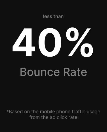
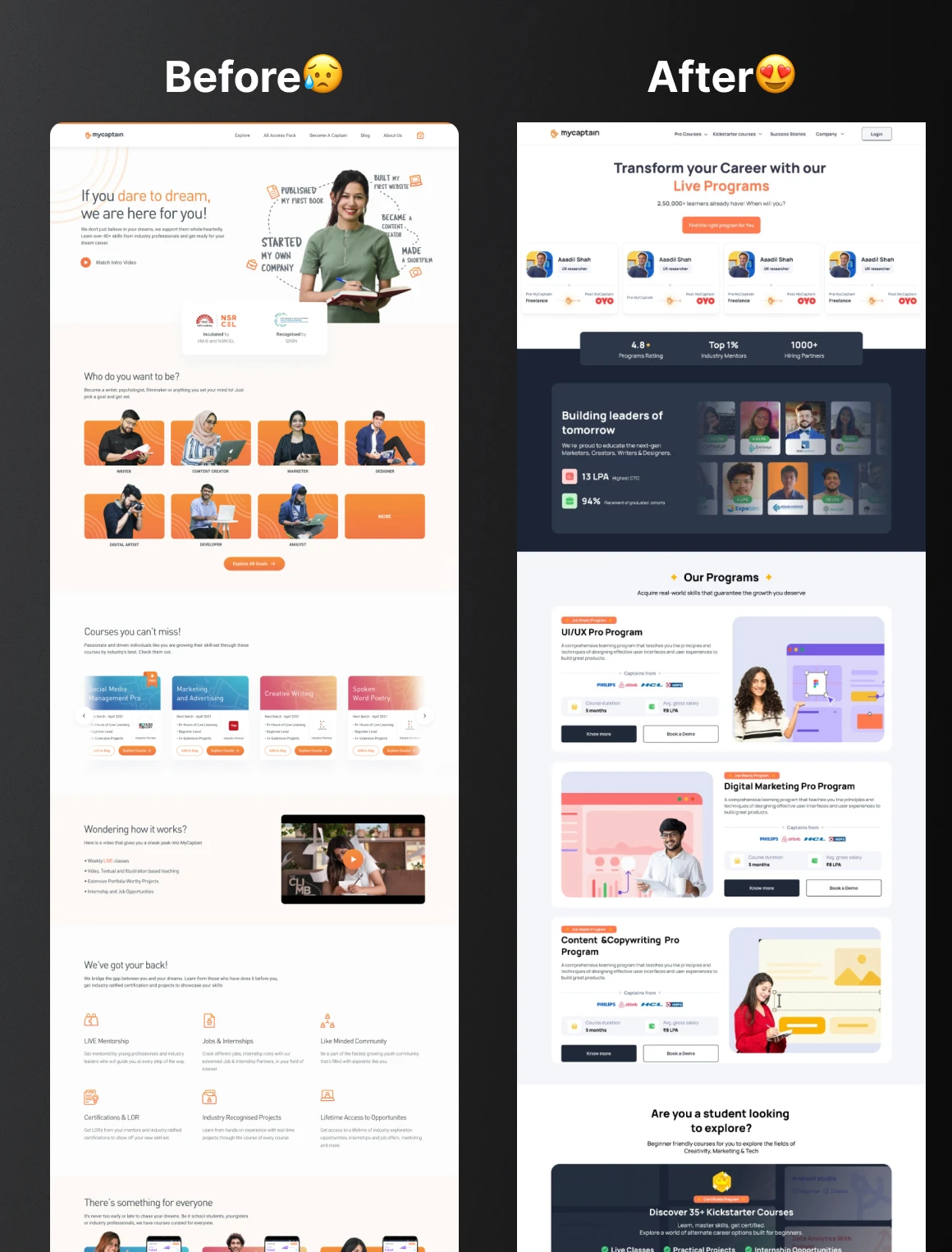
Hurray, we unveiled the landing page in Aug, 2023! Due to privacy concerns, I've left out the specific figures for these measures.
As soon as it launched, we instantly observed a 70% bounce rate for our ad, in contrast to the previous site. After 50 days of being live, we experienced a ≈65% decrease in the bounce rate

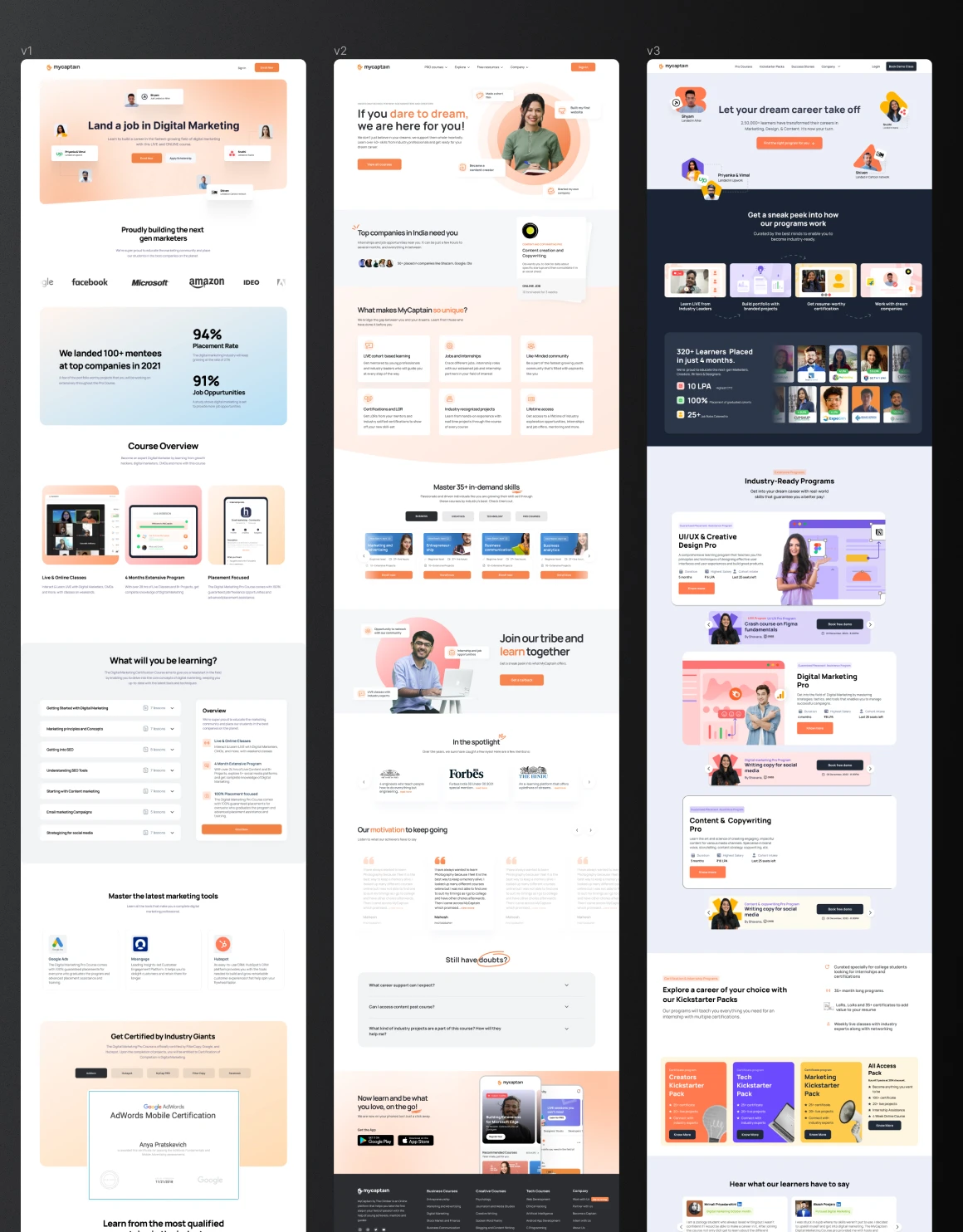
HOW ITS STARTS
We started by looking at competitor websites and collecting ideas. This helped us decide which sections were most important for our own site, based on what users seemed to pay attention to on other platforms
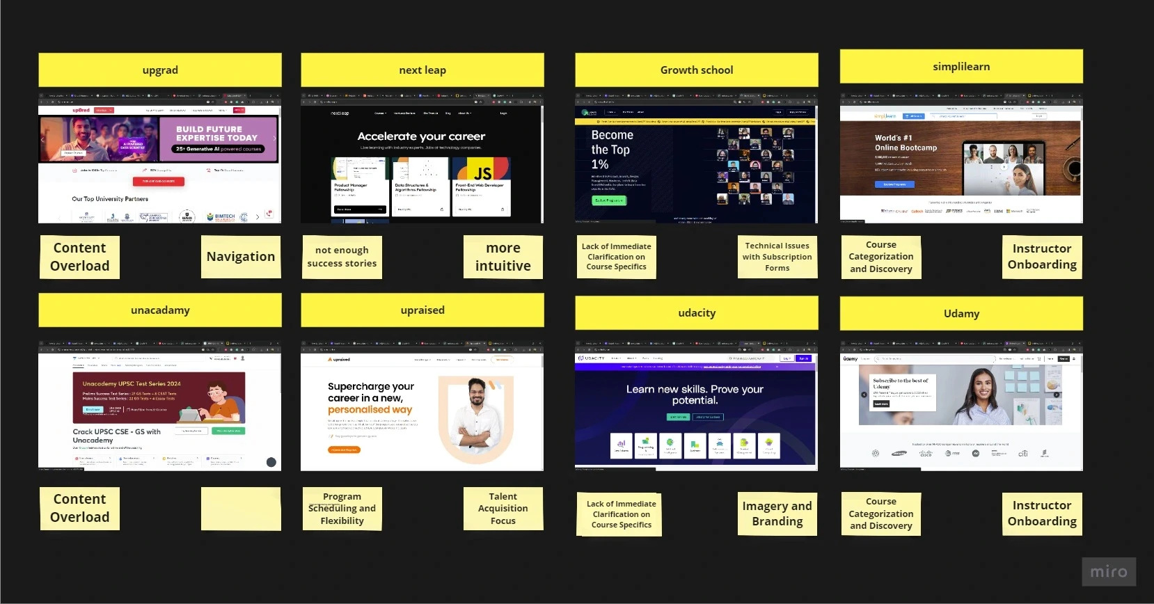
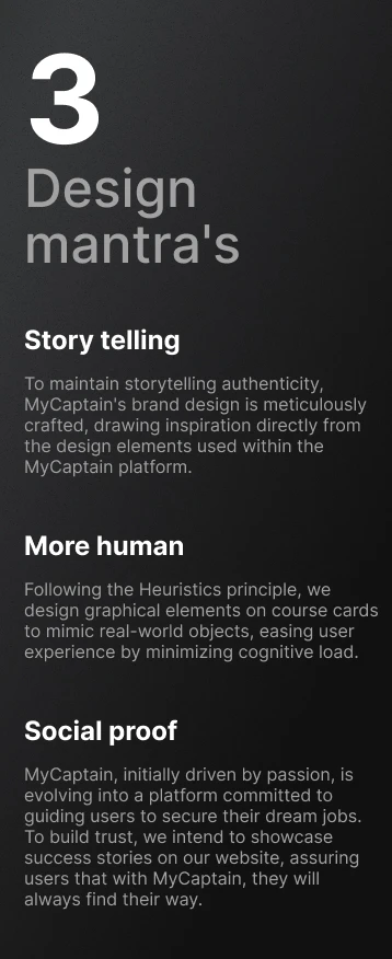
Once we finalized the structure, the next step was to figure out what we should prioritize for our users. Then we prioritized the structure by focusing on three key things that matter most to our users

Low - fid wireframe
Our first draft focused on a mobile-first approach to ensure smooth, easy access and seamless navigation. We also used intuitive visual cues to guide users effortlessly through the website
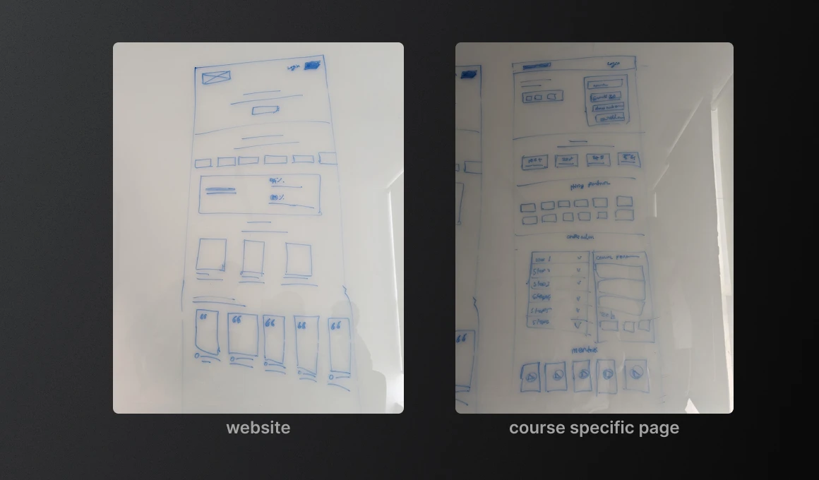
Wireframe
Here’s a look at the early wireframes. On the left, we mapped out the purpose of each section to align with our design decisions. The main goal was to guide users toward filling out the forms.
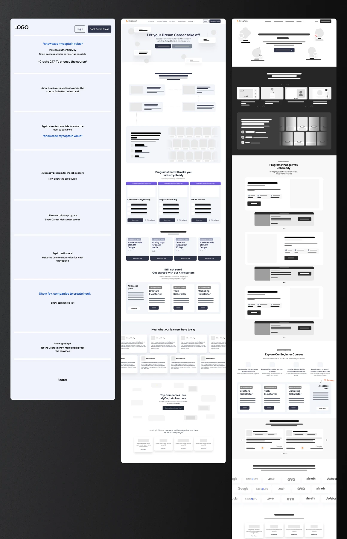
Some more variation
These are some initial concepts into detailed visuals. Experimenting with various hues and concept and arrangements. However, it still missing something, so we persistently polished these designs.
User testing
To obtain unbiased feedback from potential users, I conducted user tests with 5 individuals outside of MyCaptain using Maze's Survey tool.
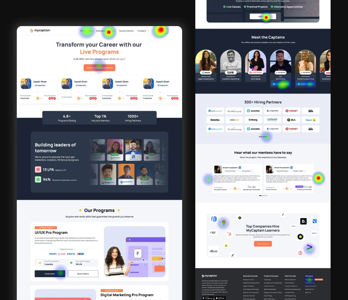
Analyzing the heatmap revealed 60% of users scroll to the landing page bottom, raising concerns about overlooked elements. Targeted surveys, done anonymously, provided unbiased feedback, confirming users understood the core concept.
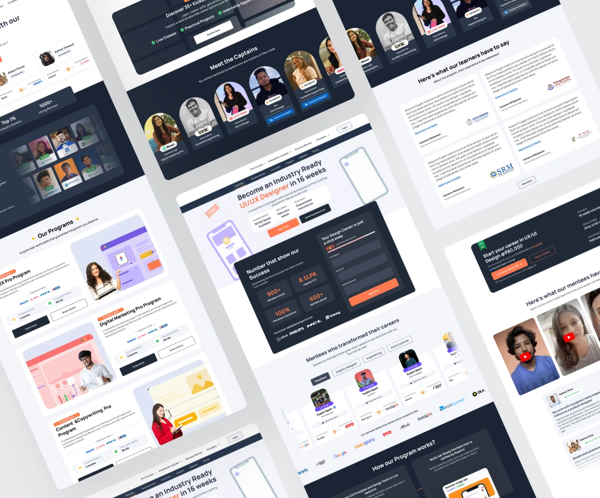
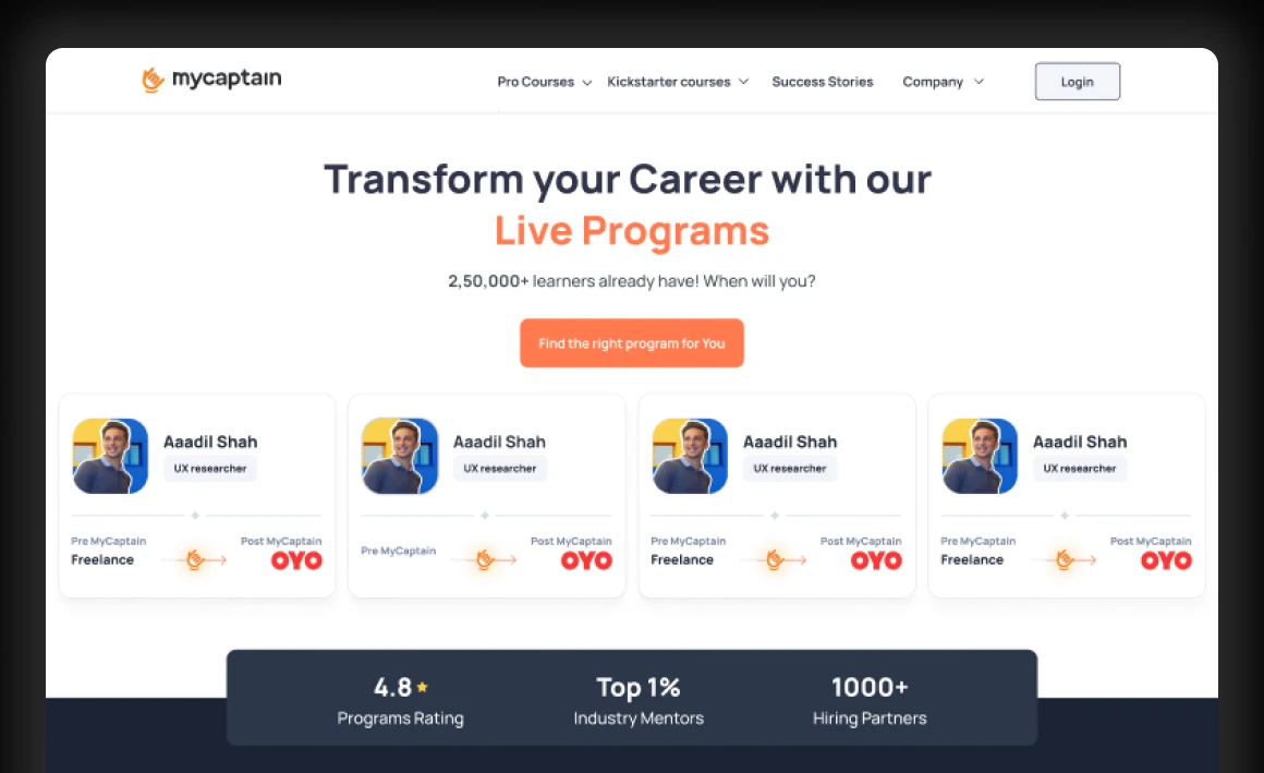
FINAL RESULT
Strong social Proof
Animation
I designed all the animations using Lottie, And Some of my animations were even featured as 'Pick of the Week' by the official LottieFiles creators.