Mycaptain LMS

Mycaptain LMS

Mycaptain LMS

Description

In this Case Study analysis, I'll be discussing my insights gained from creating an internal dashboard for the MyCaptain mentee learning management system.

Description

In this Case Study analysis, I'll be discussing my insights gained from creating an internal dashboard for the MyCaptain mentee learning management system.

Description

In this Case Study analysis, I'll be discussing my insights gained from creating an internal dashboard for the MyCaptain mentee learning management system.

Client

Mycaptain

Year

2023

Type of Project

Education Dashboard

Client

Mycaptain

Year

2023

Type of Project

Education Dashboard

Client

Mycaptain

Year

2023

Type of Project

Education Dashboard

BRIEF

Expanding with educators and students, we found the existing MVP model, created in a 7-day stretch in early 2022, and now a days outdated and lacking functionality.


To address this, we decided to overhaul the portal, introducing the Soul design language as part of the MyCaptain rebranding project. With the talented Design team (Krishna, Krithika Kalahasthi, and Sharanya Chakravarthy), let's explore the exciting updates! πŸš€

PROBLEM

Currently, more than 90% of our visitors originate from advertising alone. Owing to limited engagement, we haven't focused on enhancing or developing additional functionalities for the site.

Problem #1

Boring Onboarding

Lengthy forms were discouraging users, prompting the need for a more engaging onboarding experience.

INSIGHTSπŸ’‘:

Typical form-filling behavior leads to user disinterest and lacks motivation for profile completion. Insufficient information in the track section is a concern.

Problem #2

No proper direction to choose the next class

Unclear guidelines for the group cause user frustration, increasing the likelihood of quitting.

INSIGHTSπŸ’‘:

Multiple hotspots directing the user to the same action can cause cognitive overload, reducing the user's interest in the platform.

Problem #3

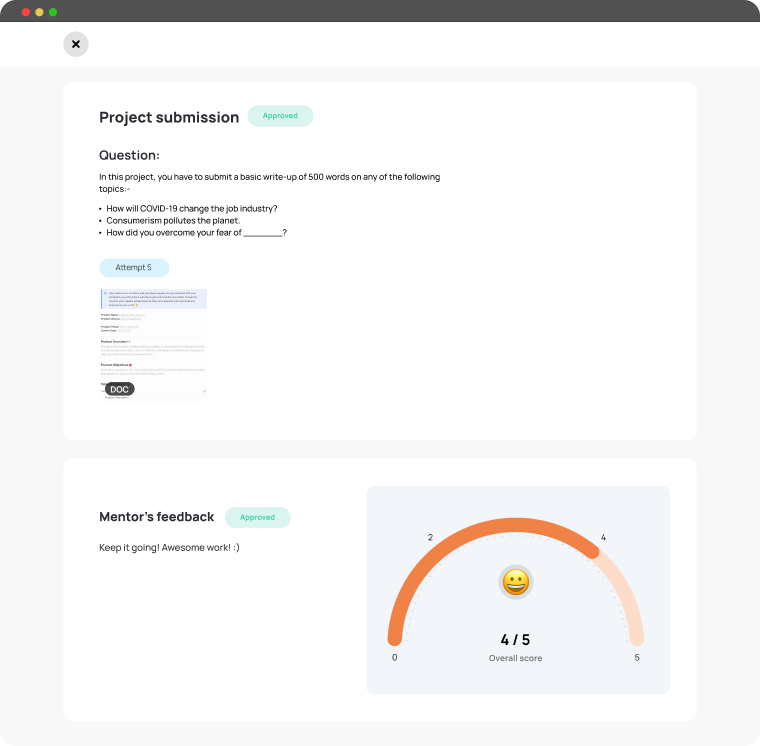
Lack of knowledge in the project submission

The project submission page failed to clearly guide users on how to submit and upload their projects, including crucial details like the submission deadline.

INSIGHTSπŸ’‘:

Actual issues arose because the bulk of the content caused the file upload section to shift out of the viewport, confusing users during project submission.
Problem #4

Inconsistent Experience

Inconsistent design disrupts the user experience, increasing the likelihood of users getting lost in the app.

INSIGHTSπŸ’‘:

The design components look different on most pages, so when one component breaks, the app crashes.

GOAL

We aim to revitalize the MyCaptain website by enhancing user engagement, improving aesthetics, and streamlining the user journey, focusing on the following objectives:

Business Goals:

Enhance the worth proposition of Core product

To reduce redundancy and minimize hands-on effort in maintaining the platform, thereby cutting down financial expenditure, we aim to integrate different systems. For instance, incorporating narration during user orientation could potentially increase the client onboarding rate to 80%.


Ie: Per day i used to get 50-80 onboarding issues, including OEs channel etc.- Sudhakar(Customer experience manager)

Operational efficiency

A platform with less manual power and user inquiries indicates it's self-explanatory, understood at first glance with no need for forced learning perspectives.

User Goals:

An enjoyable, uniform customer experience

To confirm a suitable design structure is established to minimize technical liability, and provide our users a superior, uniform experience.

To confirm a suitable design structure is established to minimize technical liability, and provide our users a superior, uniform experience.

To confirm a suitable design structure is established to minimize technical liability, and provide our users a superior, uniform experience.

IMPACT

First we started with redesign the onboarding Process

To innovate beyond standard form-filling, we crafted a Digital Resume platform for users to vividly showcase skills and knowledge gained through MyCaptain. It features storytelling animations highlighting their progress.

The revamped onboarding process led to a notable boost in user engagement and satisfaction. Users were more motivated to complete it, finding the new storytelling features engaging. The redesign also improved intuitiveness and user-friendliness, facilitating smoother navigation.


β€’35% of testing users reported increased motivation to complete the onboarding process with the redesigned platform.


β€’45% of testing users planned to spend more time on the platform with the new storytelling experience.

HOW ITS STARTS

We conducted extensive user research to understand the pain points of the current onboarding process. Here's what users shared:


β€’ "The forms are too long and tedious. It feels like a chore to fill them out."

β€’ "I feel isolated during the onboarding process. There's no interaction with other users or the MyCaptain

team."

β€’ "I don't understand the purpose of providing so much information during onboarding. What is it used for?"

We conducted extensive user research to understand the pain points of the current onboarding process. Here's what users shared:


β€’ "The forms are too long and tedious. It feels like a chore to fill them out."

β€’ "I feel isolated during the onboarding process. There's no interaction with other users or

the MyCaptain team."

β€’ "I don't understand the purpose of providing so much information during onboarding.

What is it used for?"

Our primary goal was to streamline onboarding into two parts: user and course. Before diving into designs, we outlined user steps to avoid information overload and aimed to create a delightful experience through diverse brainstorming flows.

Research

Goal 1:Simplified new flow

🀩

Our main focus was simplifying onboarding into two parts: user onboarding and course onboarding. Before designing, we defined user steps.


To avoid overwhelming users with too much information at once, we aimed to create a delightful experience by brainstorming various flows.

Once we settled on the procedure, we were prepared to commence with the outcome arising from this task; we already had a base Design System to expand upon!

The new introduction screens

😍

We aimed to innovate beyond traditional form-filling, creating a Digital Resume platform for users to vividly showcase skills and knowledge gained through MyCaptain, complemented by storytelling animations illustrating their progress.

Goal 2:Better Navigation

🧭

Users found it difficult to navigate through the platform and locate specific learning materials. To address this, we aimed to improve the navigation bar for more intuitive access to different sections of the LMS.

Additionally, we decided to introduce a separate page for 'Projects', making it easier for users to find and manage their project work.

Ideation

😍

To enhance navigation, we considered restructuring the LMS. Options included improving the current navigation bar (Option 1), introducing a sidebar (Option 2), and adding a separate 'Projects' page (Option 3). Option 4 was to use a dropdown menu for navigation.

After deliberation, we discarded Option 4 due to its less user-friendly dropdown menu, which also occupied excessive screen space, impacting scalability.

Goal 3: Driving Better Engagement

🦾

To boost user engagement, we shifted from the current notice board style to a more organized list view, making information easily digestible.

Additionally, we decided to introduce a separate page for 'Projects', making it easier for users to find and manage their project work.

Ideation

😍

We leveraged the Zeigarnik Effect to imbue the dashboard with a sense of unfinished tasks, prompting users to retain awareness of pending assignments and encouraging timely completion. This strategic application contributed to a notable rise in the project submission completion rate.

Goal 4: Improved Program Monitoring

πŸ“…

To improve user experience, we're replacing the generic course view with a mobile-friendly calendar for easier progress tracking and enhanced learning journey comprehension.

Ideation

😍

To enhance user understanding of the program, we explored multiple presentation options for the course journey, including detailed improvements, a progress bar, and timeline view. Opting for clarity and intuitiveness, we chose Option 4, the timeline view, to depict user progress and upcoming tasks effectively.

LEARNINGS

This project enabled me to delve into e-learning gamification, incorporating leaderboards and weekly checklists for increased engagement.


It underscored the significance of user-centric design, emphasizing that impactful improvements prioritize problem-solving over major visual changes. Additionally, the project emphasized the value of iterative design and testing, influencing my approach to future projects.

And… That’s a wrap! πŸŽ‰

I trust this case study was enlightening and valuable to you all. Should there be any queries, don't hesitate to reach out to me on any social media channel. I'd be more than willing to engage in a conversation with you.