Pink 360
Description
In 2021, Fitness one wanted to redesign their exciting app Pink360( Diet and Workout app exclusive for woman’s) and also introduce new features like live Class streaming and customised diet plan.
Client
Pink 360
Year
2021
Type of Project
Mobile app
BRIEF
Problem
The previous design, despite attracting a large audience of house wife's, failed to encourage users to follow their diet and workout plan. As a result, users had to visit the gym center offline to access the diet and workout plan, and it leads to lot of manual efforts
A poor user experience can lead to a decline in business, especially when features fall short compared to competitors, resulting in subscription losses.


Problem 1: Poor navigation
In the old design, they used a donut wheel navigation that allowed users to switch between workout and diet plans with a click. However, it cluttered the screen due to poor color hierarchy and excessive information, making it overwhelming for users.
Problem 2: NO Diet plan Personalisaion
Most of the user's struggle to create a plan due to a lack of guidance, and the meal selection process feels boring. Hard-to-tap day selection tabs, small buttons, less prominent to the Cals, and a weak layout affecting readability make the experience frustrating.

Problem 3: confused Workout Plan
The workout plan lacks appeal and clarity. There's no easy way to view the full set, forcing users to search for alternatives. As a key section of the app, poor design and a confusing flow make the experience frustrating.

User Persona
I sat with over 7+ active users includes house wife to working professionals and figured out the following problems:
Through this discovery process, I identified diverse user groups with distinct needs and preferences.


Competitor analysis
This process involves gathering and analyzing data on competitors' products, services, market share, pricing strategies, marketing tactics, and overall business performance. The goal is to identify key players in the industry and assess how their actions may impact the business in question.


Wire frame
After finalizing the Information Architecture through iterations, we proceeded to create high-fidelity wireframes. These wireframes were then advanced to the Visual design stage, ensuring that each individual's pain points and opportunities were addressed in alignment with the previously mentioned considerations.
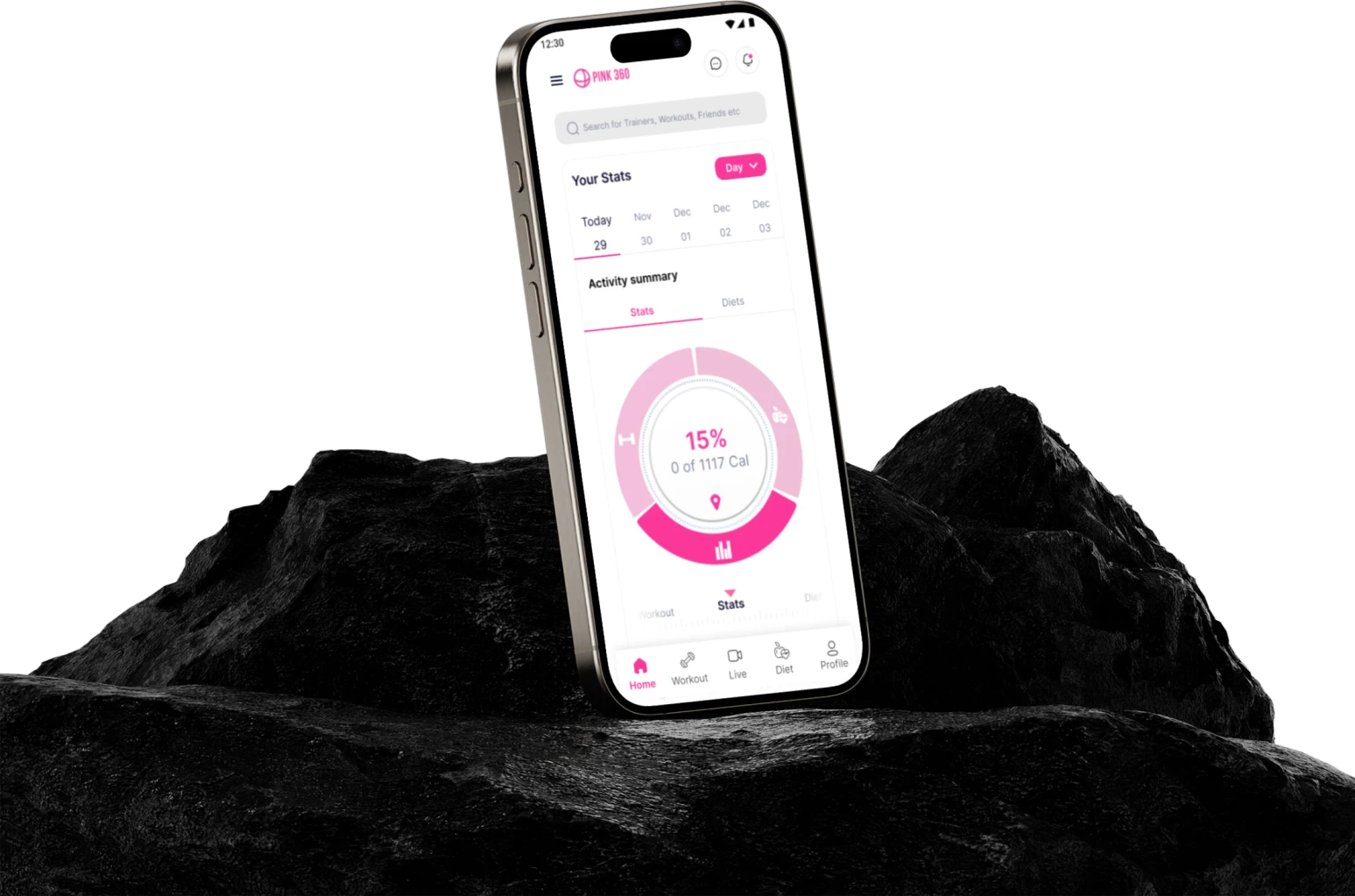
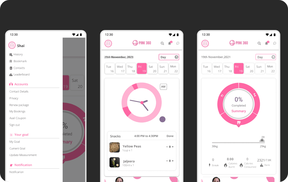
FINAL Design
Our aim was to develop a compelling and impactful workout experience. Incorporating high-quality video exercises led by top trainers injects a sense of enjoyment into the workouts.
The utilization of common symbols and fitness-related terminology streamlines the app's functionality, making it more efficient and fostering user familiarity.
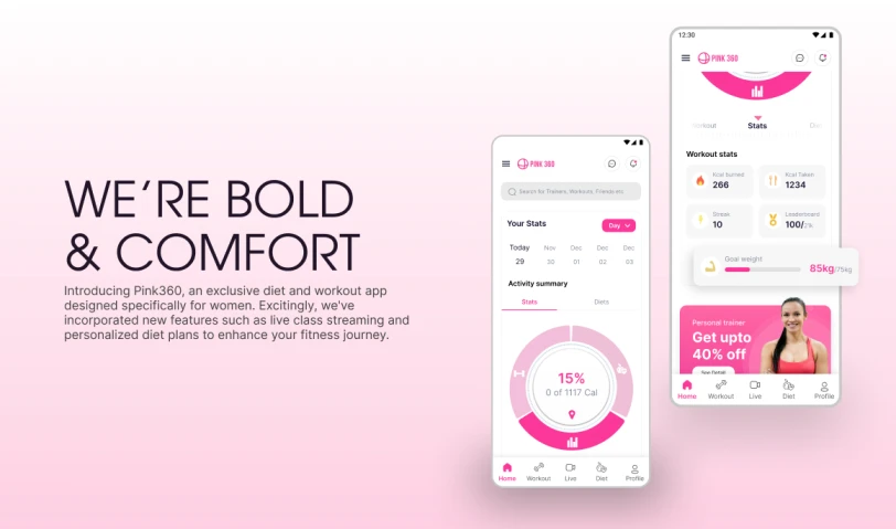
For the Pink 360 app, we developed vibrant and captivating user interface displays, celebrating a diversity of metrics, an array of diet plans featuring diverse food options, exercise regimens, and other impactful visual elements, made seamlessly accessible to users.

LEARNINGS
Through consumer testing, I learned how to conduct effective user research, perform competitor analysis, build a consistent brand identity, and align design changes with key stakeholders.